Autodesk Rebranding
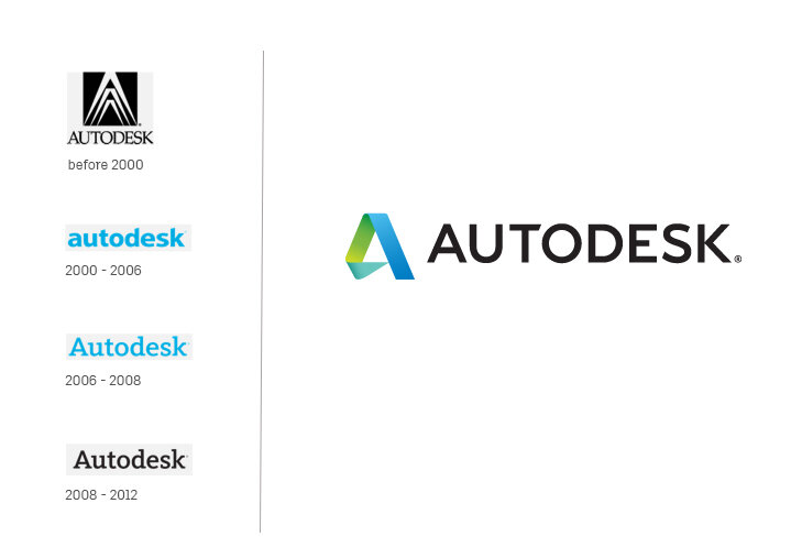
Autodesk went through a large transformation. It changed from a software in a box sold once to a SaaS model where we had to earn out customers’ trust every month as they now subscribed to the products. The products moved to the cloud, the business model changed to a subscription model, and the customer base tripled in size. It was time to signal this change to the world, so the in-house design teams redesigned Autodesk’s corporate identity, and developed a new design language. We developed a language that speaks to imagining, designing and creating (or making) the future.
Watch these
This is the work the Autodesk Creative team did in 2015 and 2016. It gives you a nice overview of the range, variety and quality of the projects.
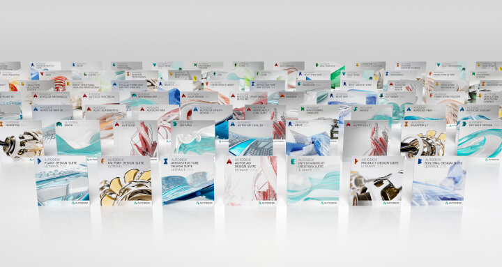
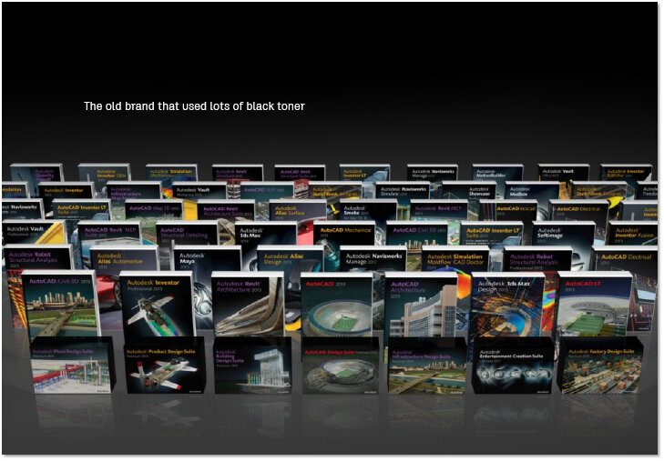


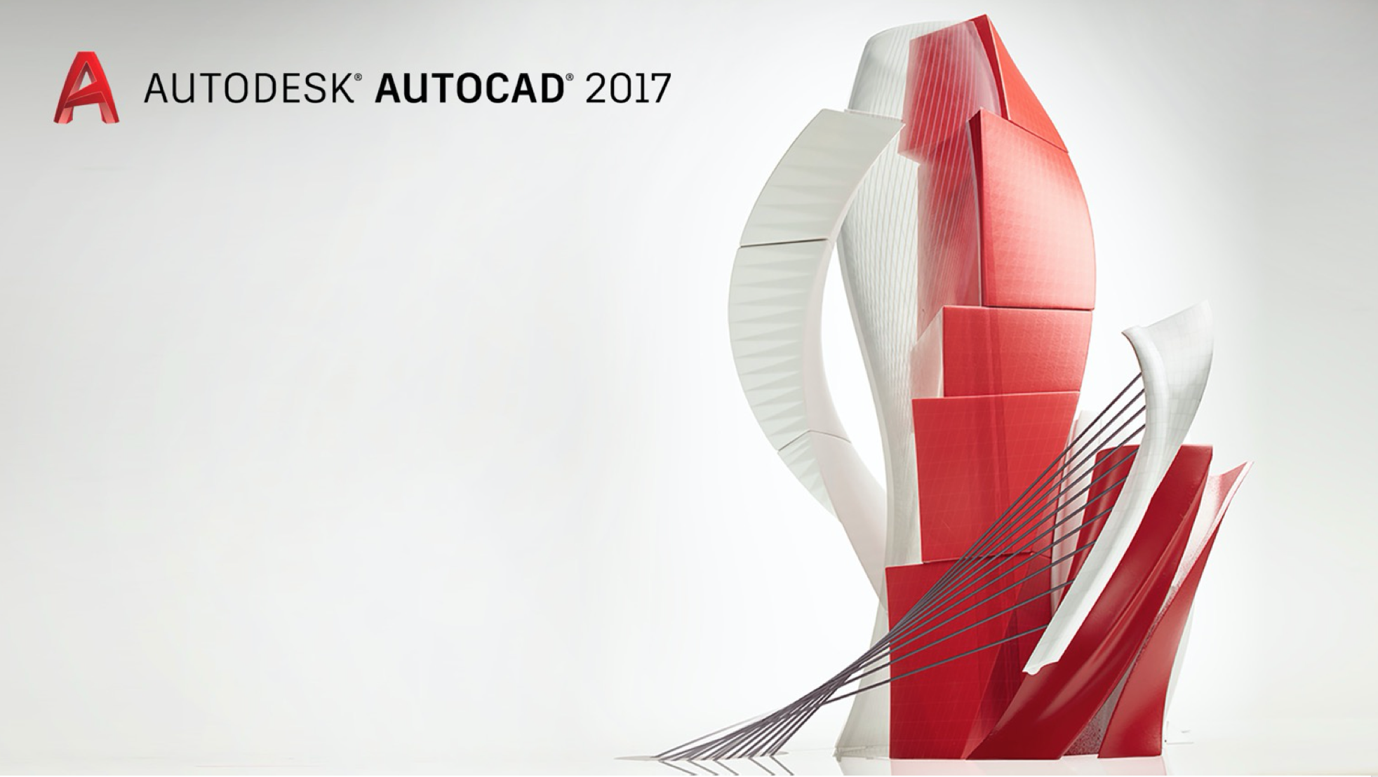
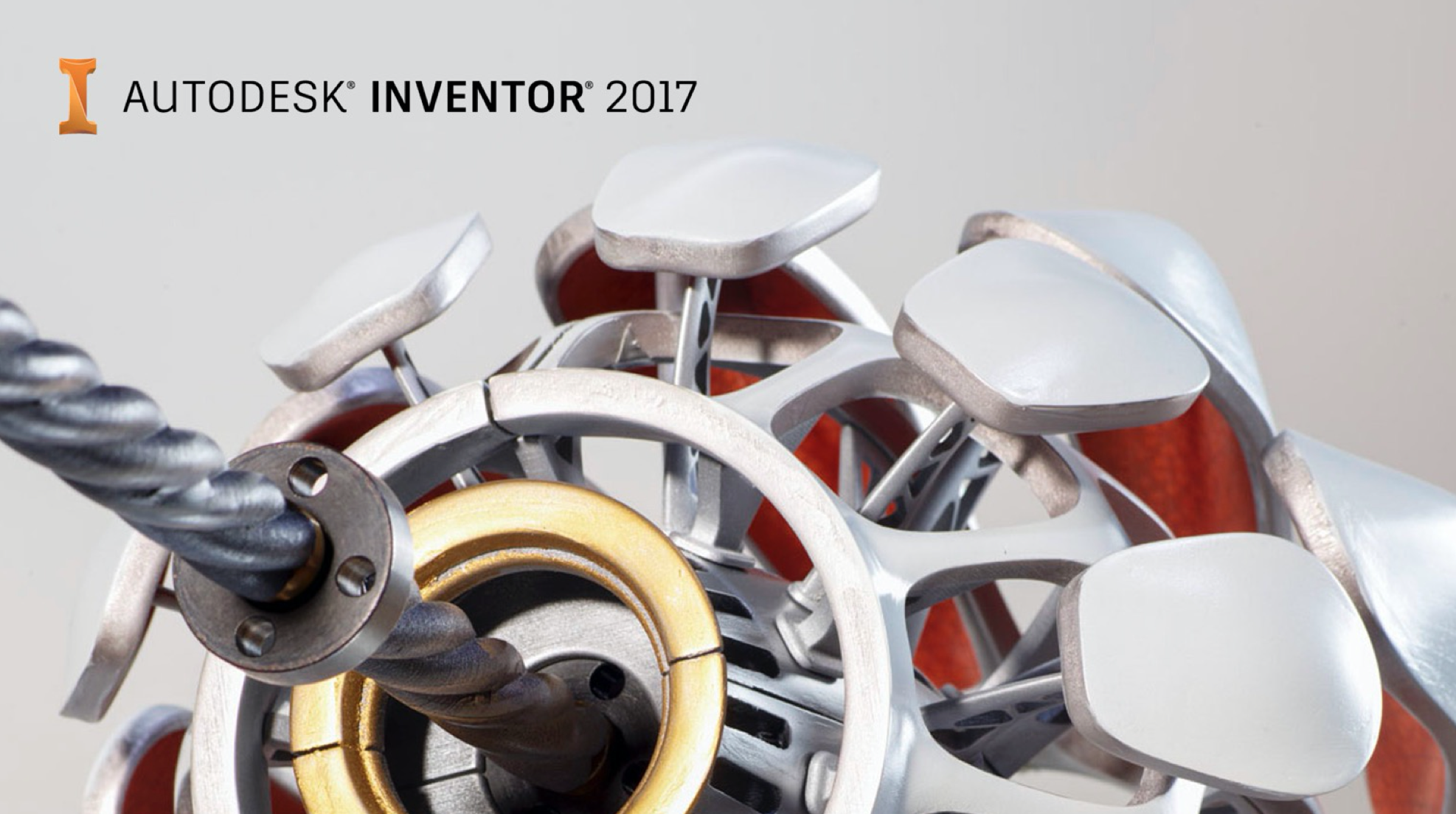
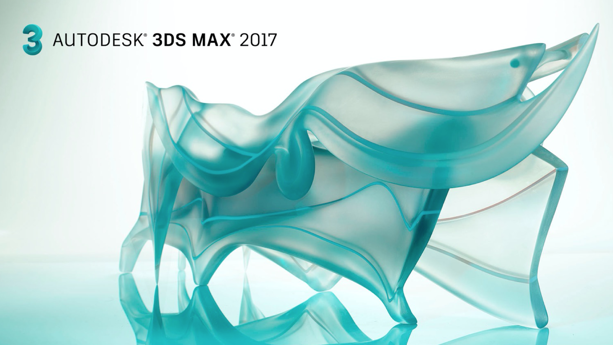

The new design language lightened up the palette, changed imagery from regular data sets to original images that speak to imaging, designing and creating the future. Products each have their own hero image. They’re abstract and capture the essence of the product but aren’t intended to communicate what the product does.
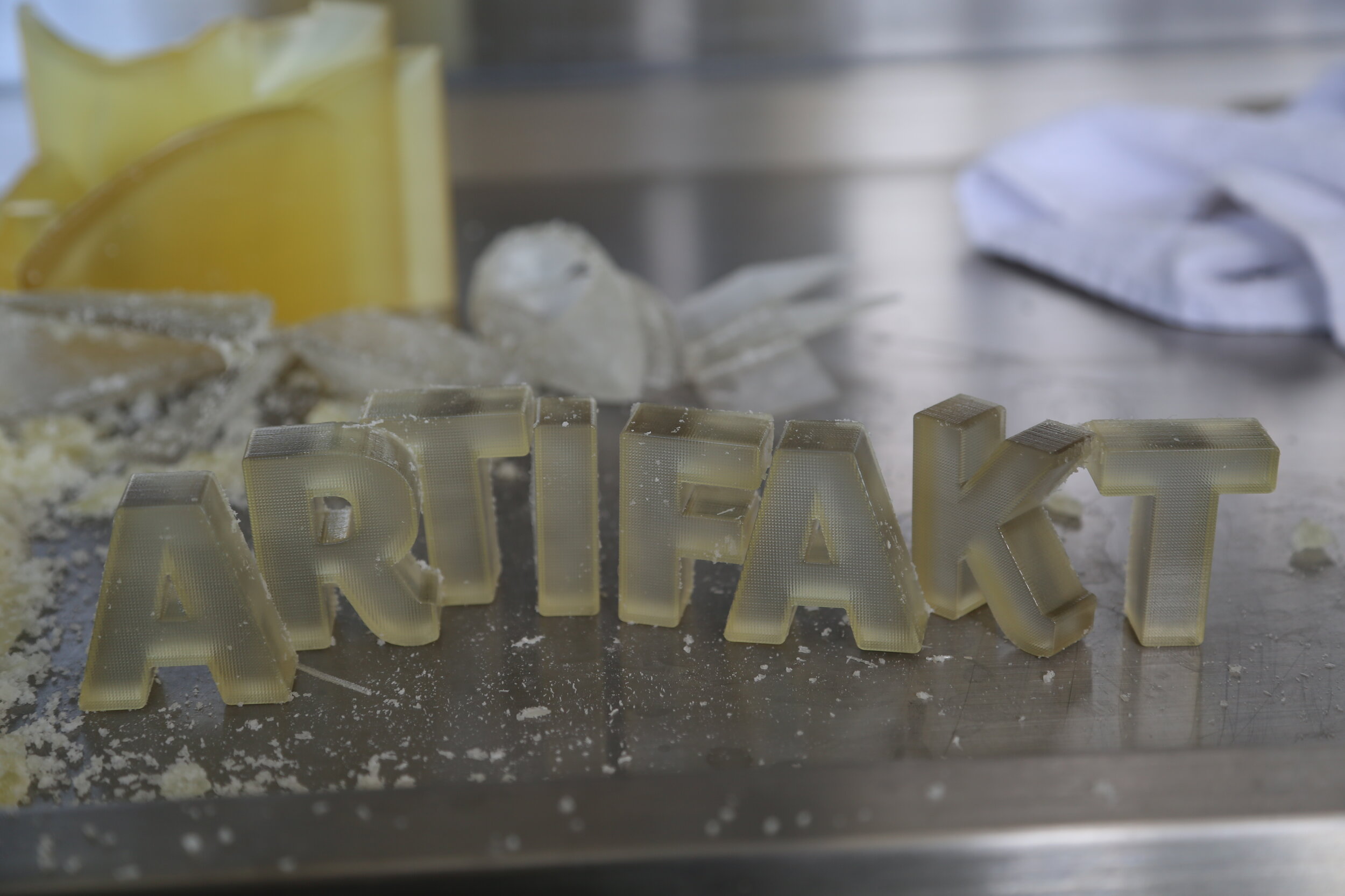
The typeface Artifakt was designed by Erik Spiekermann. It is implemented in product and on all other brand assets, and it is used to this day at Autodesk.
The 3D design team won Best 3D Artist in the World 2016